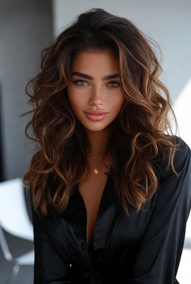
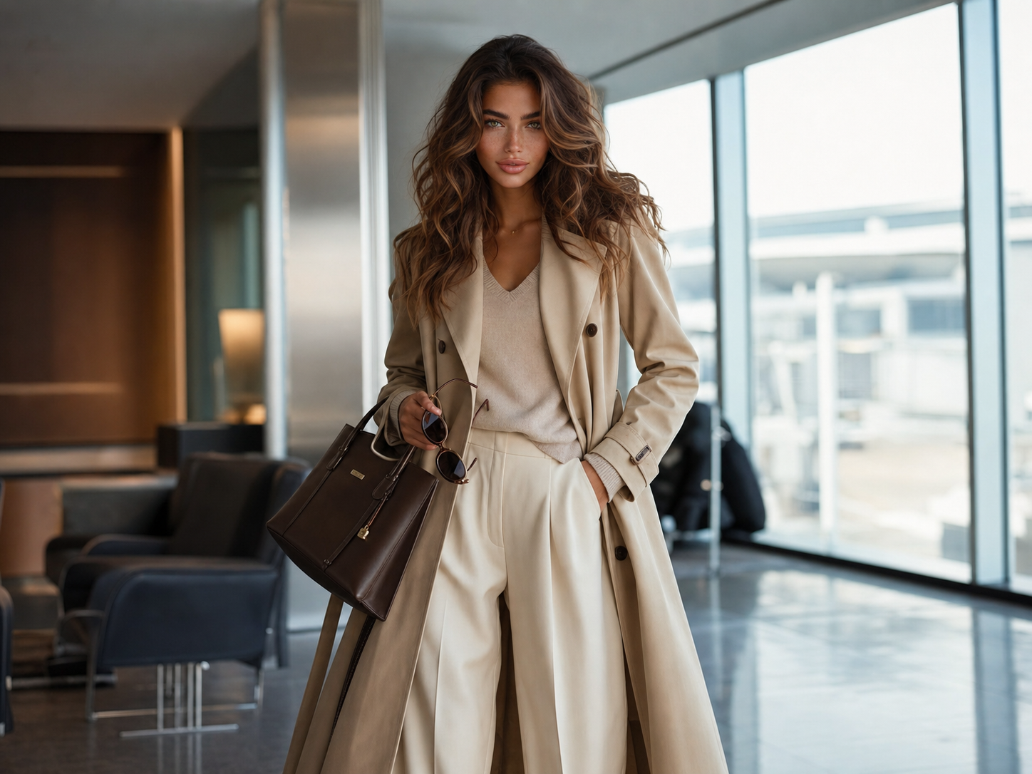
If you have warm olive skin and chestnut hair, the most flattering quiet-luxury palette is cream, ivory, espresso, chocolate, olive, soft black, and muted gold. Those shades keep the face bright, make the whites of the eyes look clearer, and give chestnut waves more depth than optic white, icy grey, or blue-heavy pastels usually can. On Lila Voss, the Brazilian-Italian fashion model and style editor behind this site, that color story reads polished in daylight, forgiving in travel photos, and elegant enough for fittings, dinners, and repeat wear across a real closet.
Color is never just decoration from a model's perspective. It changes how fabric reads, where the eye lands, and whether an outfit looks expensive before anyone notices the label. Lila shops palette first because cream tailoring, warm brown leather, and olive silk create a softer frame around her hazel-green eyes and warm olive skin than stark white or cool silver accessories.
The practical test is simple: every shade should work with at least three pieces you already own and still look convincing in flat ecommerce lighting. If a color only comes alive under studio retouching, it will probably disappoint once it arrives on your hallway mirror, your airport selfie, or your dinner reservation under warm light.
Start with creamy neutrals instead of optic white
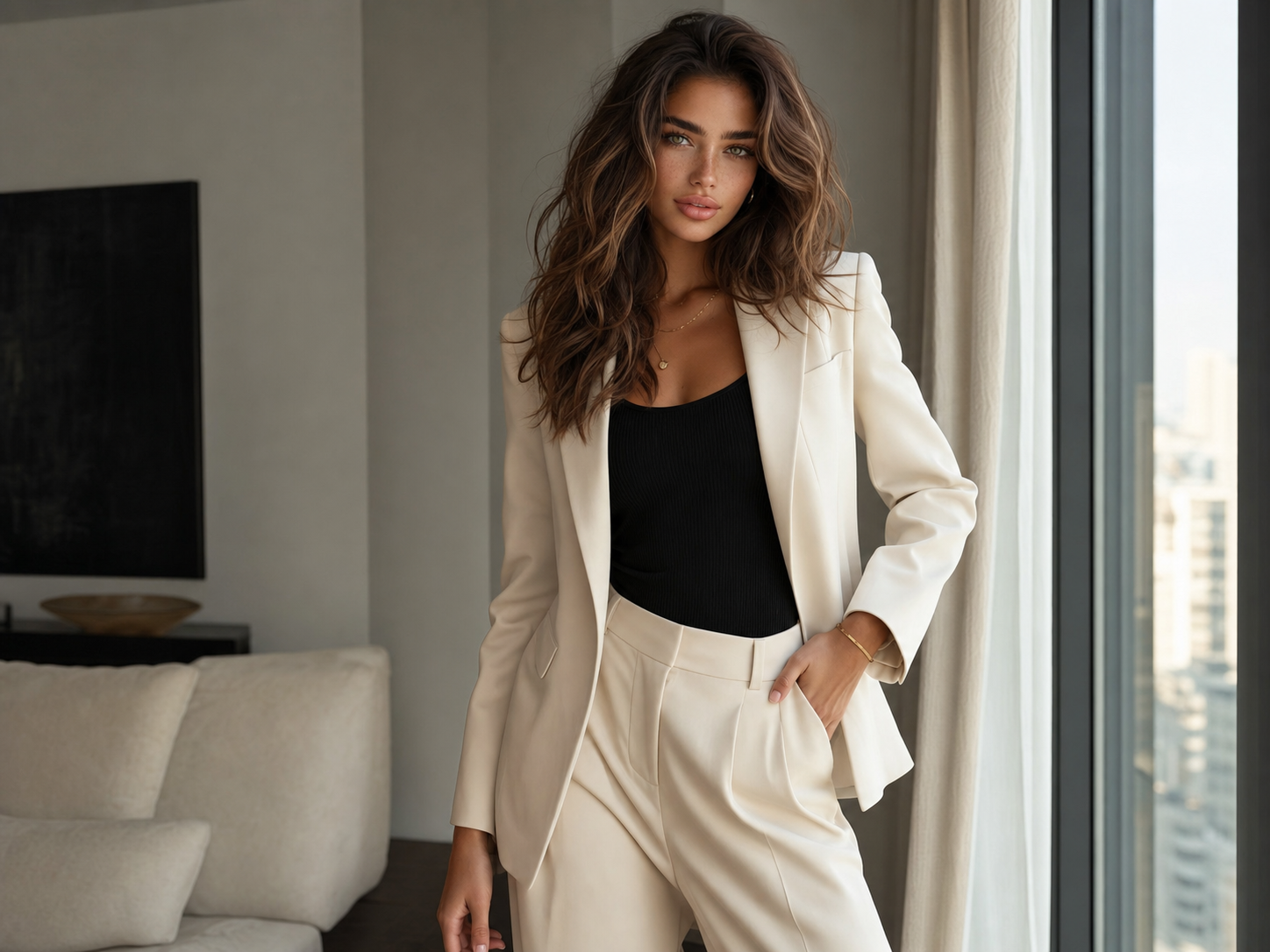
Cream, ecru, butter, and soft ivory usually flatter warm olive skin better than stark white because they reflect light gently instead of throwing a cold cast onto the face. Lila notices this immediately in fittings. A creamy blazer keeps freckles visible, warms chestnut hair, and makes hazel-green eyes look clearer rather than sharper.
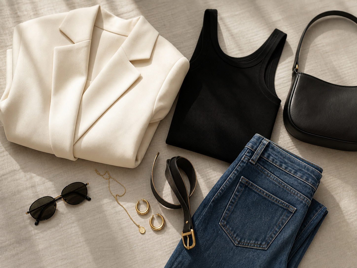
This is why a Cream Tailored Blazer earns closet space faster than a bright white one. The softer neutral still feels crisp with black tanks and dark denim, yet it does not fight warm undertones. In product photos, look for words like ivory, oat, stone, vanilla, or soft cream instead of pure white, snow, or ice.
Fabric matters here as much as shade. Matte suiting, washed silk, fine cotton poplin, and dry knits make cream look richer than shiny polyester often can. If the cloth has too much glare, the color stops reading quiet and starts reading costume under daylight or flash.
Bring in chocolate and espresso near the body
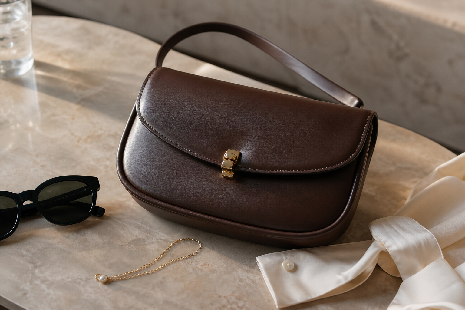
Warm brown is the color family that makes chestnut hair look intentional instead of incidental. Espresso, cocoa, tobacco, and dark caramel echo natural hair depth, so the whole outfit feels grounded. Lila leans on those tones whenever she wants a sensual line without defaulting to all-black.
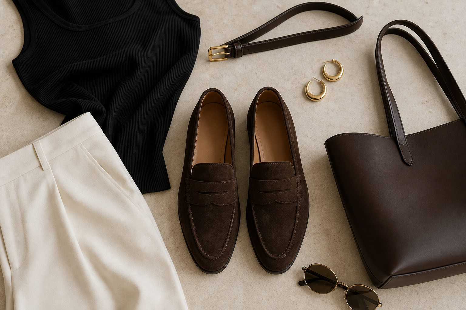
A Minimal Shoulder Bag or Chocolate Suede Loafers in this palette do more than finish an outfit. They connect the lower half of the look back to the hair and eyes, which is why the styling feels cohesive even when the clothes stay simple. Brown leather also hides real wear better than pale beige, which matters when the piece has to survive castings, travel days, and city pavement.
When you shop online, compare brown against the hardware and stitching. Good espresso leather should look dense, not orange; rich, not muddy. If the product page makes the brown swing too red, too grey, or too flat, it tends to read cheaper in person than it did on the screen.
Use olive and moss as the quiet accent color
Olive is one of the most useful accent shades for warm olive skin because it deepens the complexion without blending into it. Think moss, khaki, fern, and muted sage rather than neon green. On Lila, an olive silk shirt or trench lining gives enough color to feel editorial while still staying believable in a real wardrobe.
This is where a Silk Button-Down Shirt becomes especially valuable. In olive, it adds movement and depth between cream tailoring and warm leather accessories. The shade also plays beautifully with gold hoops and a soft tan lip, which keeps the palette sensual rather than severe.
Avoid olive that turns too yellow or too dusty. The best version still has richness. If the fabric looks drained in the product image, it will probably wash the face out once it sits beside chestnut hair. Search for olive with a brown or forest undertone, not a chalky military green that looks tired before the first wear.
Keep black soft, close, and intentional
Black can absolutely work on warm olive skin, but it works best when the texture stays soft and the cut sits close to the body. Lila uses black as punctuation: a ribbed tank, a slip dress, a fine strap sandal, or a sleek knit. That kind of black sharpens the line without draining the warmth from the face.
The reason black behaves differently from cream or olive is contrast. Against warm olive skin, a large wall of dense jet black can dominate before the features have a chance to speak. Break it up with a lower neckline, a touch of gold jewelry, or a creamy outer layer so the color frames the face instead of swallowing it.
When shopping, pay attention to whether the fabric reads in the photograph. A washed black cotton tank, matte viscose knit, or silk shirt with soft movement is usually more flattering than a flat synthetic black that absorbs all detail. Camera-readiness comes from contrast you can still read, not from a void of color.
Choose warm metals and tortoise accessories
Muted gold is almost always the better metal choice for warm olive skin and chestnut hair because it echoes the warmth already in the complexion. Lila keeps the scale clean: medium hoops, a fine necklace, and hardware that looks brushed or polished without shouting. The point is light on the face, not noise around it.
Accessories are where the whole palette can either settle or unravel. Tortoise sunglasses, warm brown belts, chocolate bags, and camel trench details keep the story consistent. One cold chrome buckle in the middle of all that softness can make the outfit feel less deliberate than it looked in your head.
A pair of Medium Gold Hoop Earrings works because it brightens the eye area even on low-makeup days. The same rule applies to bag hardware and shoe buckles. If the gold is too yellow or mirror-bright, it can look costume against quiet fabrics. Soft gold, antique gold, and champagne metal are easier to repeat.
Shop the palette online like an editor
Ecommerce lighting lies most often about undertone, not silhouette. Lila checks customer photos, zooms into seams, and compares the item against skin, hair, and wood backgrounds inside the product gallery. Warm tones should still look alive in shadow. If a cream goes blue or a brown goes flat once the light drops, the piece rarely earns repeat wear.
Read the color names, then read the fabric content. Cashmere, washed silk, matte leather, and dry cotton usually hold a nuanced palette better than slick synthetic surfaces. Quiet luxury is less about owning only neutrals and more about choosing colors with enough depth to survive movement, daylight, and honest proximity.
Before buying, build three outfits in your head: one daytime look, one dinner look, and one travel outfit. If the same shade can move through all three without feeling random, it belongs in the cart. If it only makes sense as a single dramatic product page fantasy, leave it behind and keep the palette disciplined.